Do corporate media reporters ever actually read what they write? Do they ever proofread, or check their facts for accuracy?
The occasion for asking such seemingly mundane questions is a snippet of “reporting” by Monica Beals, staff writer for The Hill. Her opening salvo is this bit of fear mongering about how high COVID case numbers are this year compared to last year.
The Johns Hopkins Coronavirus Resource Center showed a seven-day average of 119,725 cases as of Saturday. That figure held at 17,887 cases on May 28 of last year.
Despite the rising infection rate, COVID-related deaths were down from last year, a sign of increased immunity through vaccines and prior infections, along with wider availability of treatments.
There is just one problem with the 2022 number: It’s wrong. Significantly wrong.
Johns Hopkins’ REAL Numbers
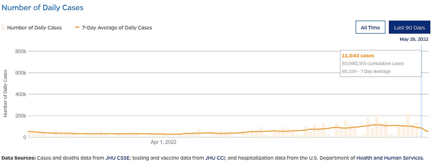
According to the Johns Hopkins Coronavirus Resource Center current figures (as of this writing), the seven-day average for the United States for May 28, 2022, is 85,159. Ms Beale overstates the number by 34,566, or 40.6%. That’s a rather large error of fact.
The seven-day average for the same day last year she correctly states at 17,887.
The error is significant not just because of the magnitude, but also because Ms Beale fails to acknowledge that the Johns Hopkins data shows COVID cases in the US declining since May 18, 2022.
Viewed graphically, the Johns Hopkins case data looks like this over the past 90 days:
For perspective, the graph since April of 2020 (when the data set was initiated), looks like this:
Yes, there was a small “wave” of infection—if one which to categorize every upward trend in cases as a “wave”—but, going by the Johns Hopkins data, that wave is now over.
Ms. Beale is writing about a presumptive crisis that no longer exists even by her metrics.
How did she come to be off by so much? The probable answer that she looked at the data on Saturday and so was almost certainly seeing the seven-day average up to Friday, May 27—the data presentation is always one day behind. If that was the case, the May 25 spike in cases to 216,703 very likely dominated her numbers.
The Johns Hopkins seven-day average also fluctuates somewhat within the latest seven-day period shown. When I first examined these charts the seven-day average for May 28 was 96,637. The exact reason for this variation is unknown at this time.
The magnitude of the shift is pronounced because the reported case counts drop dramatically on the 28th, but a review of the daily figures shows a drop in cases each Saturday and Sunday.
By the same token, during the period when the seven-day average was rising, at least three daily case counts were significantly above the moving average trend line. Over the past week, the daily cases were overall much closer to the trend line, with only the Wednesday spike standing out. This underscores the fact that over time the downward trend from May 18 is demonstrable, and demonstrably overlooked.
Comparing Apples To Apples
Ms Beale also makes a significant logical error by comparing cases based on calendar dates. Her point would have been better served had she compared peak-to-peak and trough-to-trough. While the seven-day average this time last year was significantly lower than the same day this year, the trend on May 28, 2021 was much closer to the bottom of the trough, which would come on June 18, with a seven day average of 11,444 cases.
She’s comparing a point just before the start of the late-summer Delta wave with a point just after the peak of the most recent mini-wave. It is to be expected that this year’s mark is going to be significantly higher, because of where it is on the trend line.
Her comparison with the year-ago data might have dramatic effect, but it is not an apples-to-apples comparison.
Not All Parts Of The US Are The Same
Moreover, when one looks at the more granular county-level data, courtesy of the CDC, there is significant variance with the image she is attempting to cast.
The four largest cities in the US are New York (mostly located in New York County, New York), Los Angeles (located in Los Angeles County, California), Chicago (located in Cook County, Illinois), and Houston (located in Harris County, Texas).
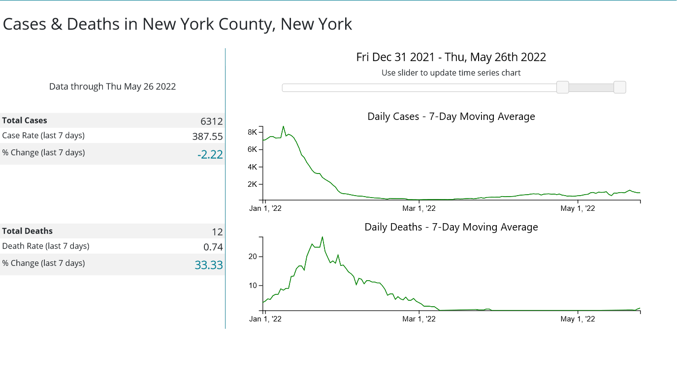
New York County, according to the CDC, has seen a 2.22% decline in the seven-day average of cases recently.
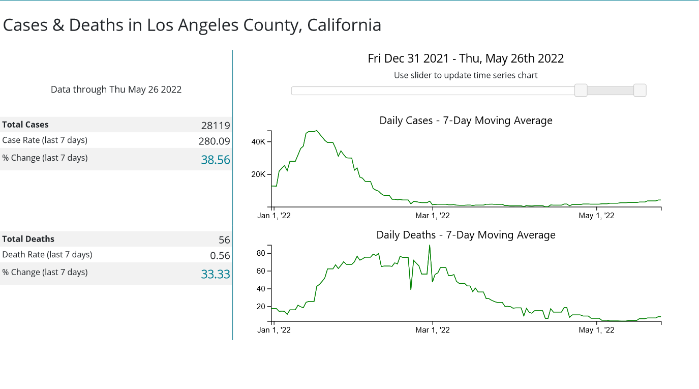
Los Angeles County, on the other hand, has seen nearly a 40% rise in the seven-day average.
Cook County, has witnessed a 20% drop in the seven day average.
While Harris County has seen a 9% rise in the seven-day average.
Without a doubt, where one is within the United States has dramatic impact on the trend and magnitude of COVID case changes over time.
When looking at epidemiological data such as COVID case counts, it is important to remember that the United States is the fourth largest country in the world by geographic area and the third largest country in the world by population. As the CDC county-level data illustrates, disease trends within the US vary widely. That variance is the direct consequence of the US’ size.
Cases Are Higher Overall
Ironically, in her quest to paint a picture of rising cases (which is untrue at the national level, and problematic at the county level), she overlooks an important aspect of the data: cases are higher overall.
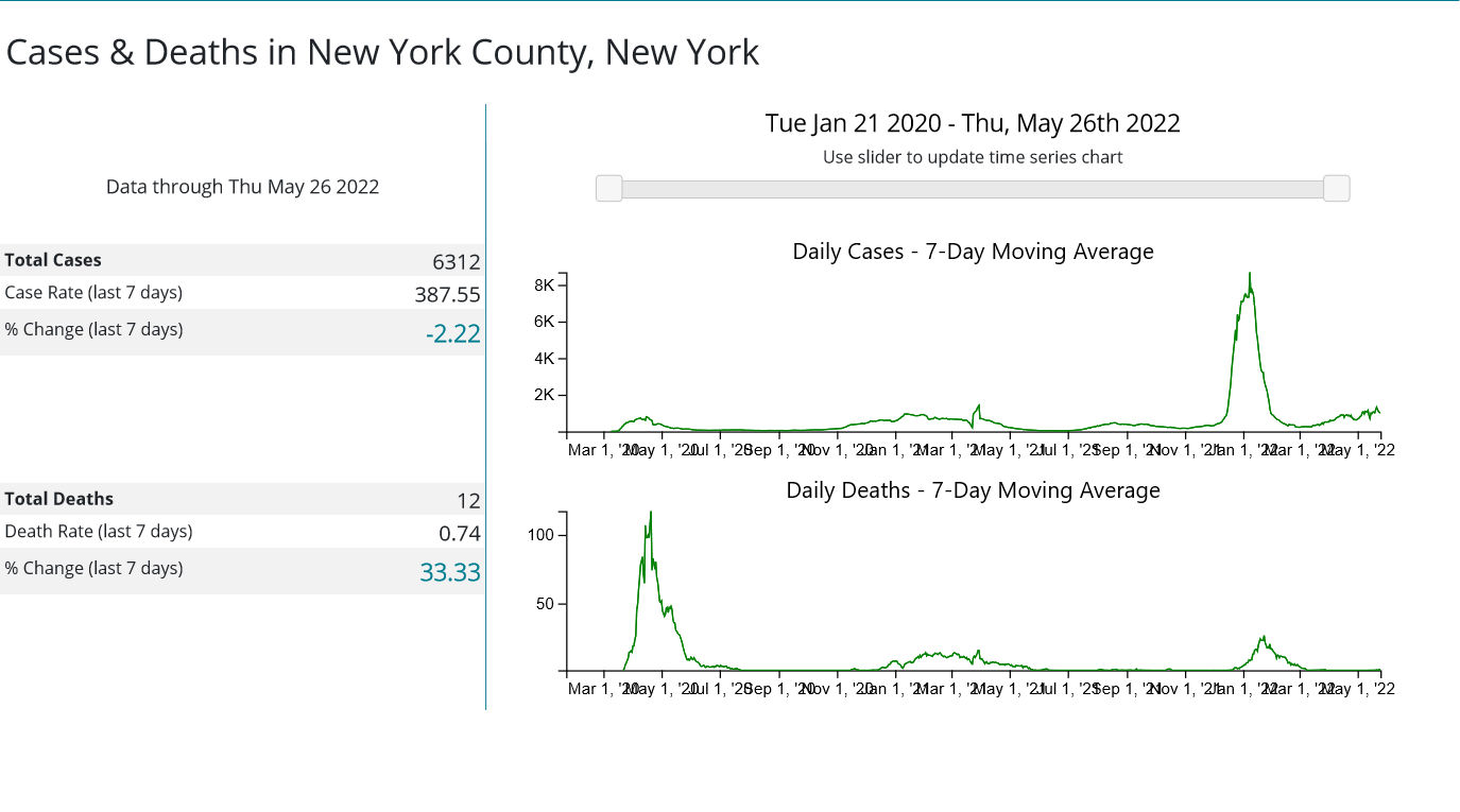
The most recent trough in cases was on April 1, at 26,668 cases—more than double the June 18, 2021 trough of 11,444 cases. A quick glance at the New York County graph shows that cases there are also, overall, higher than at previous troughs.
That is itself a disturbing reality—one which reinforces the point I made in my last article about the hepatitis outbreak: the country is “sicker” overall than it has been.
We are not merely sick with hepatitis, or gastroenteritis, we are apparently also sick with COVID.
(Important caveat: I am, for the purposes of simplicity, taking the COVID case counts at face value. How accurately they present the epidemiological reality of COVID in the US is, of course, highly problematic, for reasons I have discussed previously.)
Yet while the data shows the US is arguably sicker now than pre-COVID, what the data does not show, not at the national level nor at the county level, is a burgeoning wave of new COVID infections. A surge in cases nationwide is not in the offing, looking at the data at hand. Indeed, such “surge” as has been is already over, and the near-term trend is for cases to recede rather than rise.
That trend will, of course, reverse in due time—perhaps even as soon as this week. There will be another rise in cases, and there will be another “wave” of infection. This is the nature of infectious respiratory disease, and in this regard COVID-19 is no different than the rest of the panoply of Influenza Like Illnesses which afflicts the US and the world each year.
But that new “wave” of COVID cases is not happening yet. Monica Beale might have noticed that had she bothered to check her numbers.


You might want to correct your assertion that "New York [is] (mostly located in New York County."
Brooklyn ("Kings County") has greater population than Manhattan ("New York County"), as does Queens. See, for example, https://en.wikipedia.org/wiki/Boroughs_of_New_York_City.