Bidenomics Is BS. Bidenflation Can Be As Well
Propagandizing The Data Does No One Any Good
Facts, evidence, and data are the best weapons against propaganda.
This one proposition is the essential backdrop for every article I have written here. Knowing what the facts, evidence, and data are for any topic under discussion is, I believe, the best way to have a meaningful discussion or debate on that topic.
Yet there is an equally important requirement for a meaningful discussion or debate: honesty. When we present our facts, evidence, and data, when we argue a particular narrative to connect those facts together in coherent fashion, we must do so honestly and without deception. We must not willfully misinterpret the data we have, nor may we ignore any contextual background that may exist for the data we have.
A quick survey of All Facts Matter should establish beyond any and all question that we rarely get that honesty from the government. Sadly, it is frequently all too apparent that we frequently do not get that honesty from those parts of the media—both corporate and alternative—notionally opposed to government policies. As a result, we have to unpack serial bouts of dishonesty about “Bidenomics” and “Bidenflation” from outlets such as TIPP Insights, which use phony comparisons and an exaggerated “recalculation” of the Consumer Price Index to present distorted and fundamentally dishonest diatribes about the “real” nature of consumer price inflation in this county.
The dark shadow of Bidenomics is 16.2% inflation under Biden’s watch. It is a complete and utter failure that has led to stagflation in the United States. No amount of sugarcoating can hide the truth.
Is Bidenomics a failure? Yes. The regime’s economic policies have never been good news for anyone, particularly ordinary working men and women.
Has Bidenomics produced 16.2% inflation? Yes. No. Sometimes. It depends. As readers may recall, the constant caveat for all economic data and its analysis is “your mileage may vary.”
Op-ed screeds like the ones that have popped up from TIPP Insights gloss over these inconvenient realities. Rather than dissect the data that we have on inflation, TIPP Insights feels compelled to improperly mingle two different analyses in order to make their argument seem as dire and as apocalytpic as possible—an inept and unnecessary untruth.
At the heart of the TIPP Insights propaganda on inflation is a bit of nonsense they call the “TIPP CPI”.
We developed the TIPP CPI, a metric that uses February 2021, the month after President Biden's inauguration, as its base. All TIPP CPI measures are anchored to the base month of February 2021, making it exclusive to the economy under President Biden's watch.
We use the relevant data from the Bureau of Labor Statistics (BLS) to calculate the TIPP CPI, but we adjust the period to Biden's tenure. CPIs are like index numbers that show how prices affect people's lives, similar to how the Dow Jones Industrial Average reflects the stock market.
When discussing the TIPP CPI and the BLS CPI, we convert the index numbers into percentage changes to better understand and compare them.
This is, at best, a gross exaggeration of what they are doing. The reality is that the “TIPP CPI” is nothing more than the Consumer Price Index itself re-indexed to a base month of February, 2021. The Federal Reserve Economic Data system (FRED) provides indexing as one of the basic data treatments available for charting all of its data, and I use it myself quite often. “Converting” the index numbers means simply subtracting out the base value of 100, which leaves the percentage change in the data from the base.
One proof of this is the fact that I can easily recreate one of their “comparison” charts using the FRED system and their charting tools.
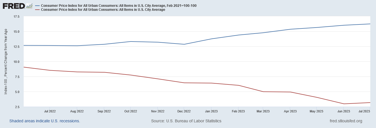
TIPP Insights offers up this comparison of the “TIPP CPI” and the “BLS CPI”:
The top (red) line is simply the Consumer Price Index, re-indexed to February 2021, with the base value of 100 subtracted. The bottom (blue) line is the Year on Year percent change in that same Consumer Price Index. When we gather these same two presentations of the Consumer Price Index on a single graph on FRED, we get the same display.
This stands in stark contrast to an authentically recalculated price index such as the “Everyday Price Index” maintained by the American Institute For Economic Research, which uses data extracted from the Consumer Price Index.
The purpose of the AIER’s Everyday Price Index (EPI) is to measure changes in the prices of goods and services that are important to people’s everyday lives. The index reflects the price uncertainty (i.e. unexpected and unavoidable price changes) that people face with purchases they cannot easily adjust from one month to the next.
The EPI tracks a subset of prices from the broader Consumer Price Index (CPI) reported by the Bureau of Labor Statistics (BLS). The CPI includes prices of all goods and services purchased by a typical urban consumer. The EPI, in contrast, includes only goods and services purchased on a day-to-day basis that cannot be easily postponed or foregone.
Thus the EPI broadly tracks the CPI, but displays greater volatility than the EPI—which is even the AIER cautions against presuming is indicative of a “better” inflation metric.
An important word of caution: The EPI should not be interpreted as an improved inflation measure. Rather, it follows prices that are more relevant to families’ everyday planning.
As I have discussed in previous articles, different indices reveal different aspects of inflation’s impact on the US economy. None of them are “real” inflation, not even the re-indexing of the Consumer Price Index TIPP Insights disingenuously labels the “TIPP CPI”.
Nor does TIPP Insights stop at just exaggeration. They go on to build their entire anti-Bidenomics rhetoric on a series of comparisons of their re-indexed CPI to the year on year percent changes to the official CPI metric.
The annual CPI increase reported by BLS is 3.2% for July 2023. Compare this to the TIPP CPI of 16.2%, a 13.0-point difference. Prices have increased by 16.2% since President Biden took office. On an annualized basis, TIPP CPI is 6.4%.
This comparison is not the “apples to apples” comparison it appears.
Merely re-indexing the Consumer Price Index has the effect of presenting the cumulative impacts of inflation from the base period going forward. The 16.2% figure being cited is the total increase in prices from February 2021. The annualized figure is achieved by dividing that total increase by 2.5 years—it is the average inflation in each year.
On the other hand, 3.2% represents the relative change in the Consumer Price Index over the preceding 12 months.
Moreover, because of the mathematics involved in shifting base periods, if we look at the year on year percent change in the CPI as indexed from February 2021—the “TIPP CPI”, in other words—we find that it matches the percent change in the July 2023 CPI exactly.
The “TIPP CPI” shows the exact same changes in year on year inflation as the official CPI metric put out by the BLS—which is what you would expect since the former is merely a mathematical restatement of the latter.
Viewed correctly, by comparing like time frames, there is no difference at all between the TIPP CPI and the official CPI.
This lack of any actual difference between the two inflation metrics directly leads to a perverse level of dishonesty by TIPP Insights when discussing the various components of the CPI, the price shifts. This is particularly evident in their observations on energy price inflation:
TIPP CPI data show that Energy prices increased by 33.5%. But, according to the BLS CPI, energy prices declined by 12.5%. The difference between the two is a whopping 46.0 points.
Taking this paragraph at face value, we are left with the unmistakable implication that energy prices are rising and not falling. The reality, however, is that energy prices have risen since February 2021, but have also fallen since June of 2022. There is no “difference” here, as both assertions are true: the Consumer Price Index does show energy prices having increased 33.5% since February 2021 and show energy prices having declined year on year by 12.5% in July of 2023. There is absolutely no conflict between these two assertions.
Where the supposed “difference” emerges is in using different base periods and different scales of measurement. Again, if we chart the two perspectives together, we can see this directly.
Note that both lines are generated using the exact same data set, “Consumer Price Index for All Urban Consumers: Energy in U.S. City Average”. They are both representations of the exact same data. The only differences are the analytical calculations applied: The one curve indexes to the base period of February 2021, thus providing a cumulative measure from that period, and the other curve is a percentage of the change in the data over the preceding twelve months. With two different period of measurement, the values come out quite differently, yet describe the same fundamental pricing reality.
Moreover, both charts show a similar pattern of a rise to a peak price in June of 2022, followed by price decline (disinflation and then deflation according to the year on year chart), followed by a price increase in the most recent month. This is important to note because these patterns also match what we see in actual energy prices
The trends align with the market prices since February 2021 for both Brent Crude and West Texas Intermediate:
The trends align with the spot prices for Brent and WTI recorded by the Energy Information Agency.
We even see the pattern in gasoline prices also recorded by the EIA, although the upward trend began around the beginning of 2023, rather than in June/July.
The TRIPP Insight Op Ed piece clearly makes it appear as if energy prices have been rising ever since February of 2021, and the extant pricing data just does not show that. Between subsets of the CPI data and real-world market and spot data, we see multiple proofs that there has been energy price inflation, energy price disinflation, and even energy price deflation.
These trends are exactly what makes the July rise in energy prices notable—and the failure of the Consumer Price Index to reflect real world energy pricing shifts in July is one of the more notable problems with the July CPI print.
Presenting a false narrative of always rising energy prices obscures these details, and leaves an inaccurate depiction of what is happening with observable (and observed) energy prices.
This is not to suggest that government policies on the economy or inflation have been either wise or effective. On interest rates in particular, the policy has been an abysmal failure and I have written about that multiple times. “Bidenomics” has been just as bad.
This is also not to overlook the reality that declining inflation merely means prices rise more slowly—but that they keep rising. The cumulative impacts of months of high inflation is a point I have addressed specifically.
Rather, this is to point out that deceptive analyses which do not treat the data honestly either ignore or completely fail to spot important shifts in the overall inflation trend. It is far less significant whether consumer price inflation is 3.2%, 6.4%, or 16.2% at any specific moment or month in time, and far more significant whether the trend is inflation up, inflation down, or even prices down (deflation).
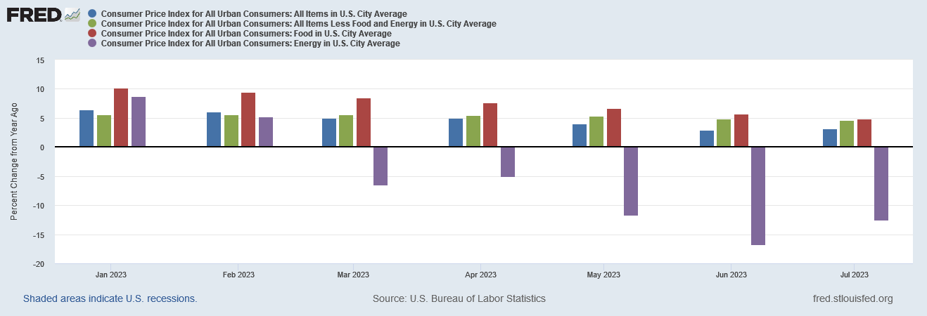
It matters that we have had energy price deflation since March in the headline CPI, because without energy price deflation the headline CPI would not be at 3%, but much closer to the “core” inflation rate of 4.7%, if not higher than that. Energy price deflation is what brought the headline inflation rate down below the “core” rate.
Energy price deflation is why the headline inflation has been declining faster than the core inflation rate.
The recent uptick in energy prices arguably means that energy price deflation might be soon coming to an end. If that turns out to be true, we are looking at significantly higher prices across the board for an exended period.
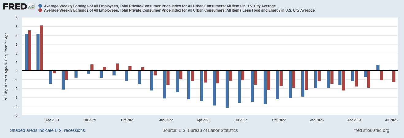
These trends matter because they underscore the extent to which incomes have been outpaced by inflation, and continue to be outpaced by inflation.
These trends matter because they highlight something that TIPP Insights completely overlooked: “core” inflation has exceeded headline inflation since March of this year. Consequently, a good argument exists that “real” earnings growth has never been positive since April of 2021.
TIPP Insights completely misses the ramification of core inflation exceeding headline inflation, choosing to present instead that real earnings growth returned to positive territory in the past couple of months.
Real weekly wages measured year-over-year have dropped for 26 of the 30 months of the Biden presidency. On a positive note, it broke a 26-month negative run in June.
This is only true if one focuses on headline inflation. If one allows for the rise of core inflation over headline inflation, then we have to acknowledge that core inflation is doing more to diminish earnings. A conservative view of “real” earnings would be to use the higher of headline vs core inflation when adjusting nominal earnings growth to reflect real growth; when one does that, then there is no real earnings growth in June and July.
By failing to present and interpret the CPI data honestly, they completely missed an important ramification of core inflation exceeding headline inflation: core inflation is arguably now more important to determining real incomes than headline inflation, and will remain so until headline inflation rises above core inflation once again.
There is simply no good reason to twist the headline data to support an oppositional narrative. The data provides ample basis for an oppositional narrative even without playing games with the headline numbers. The data we have is more than enough without any deceptive invalid comparisons to chart the inefficacy and imcompetency of US monetary and fiscal policies.
There is, however, one very good reason not to engage in numbers games with the inflation data: equipping people to effectively interpret the government misinformation on inflation. When the claim is made that “real wages” or “real earnings” actually grew, understanding how the fluctuations in energy prices have shifted the inflation metrics is essential to recognizing the manifold problems in such a claim.
People need the facts, the data, and evidence on an issue in order to understand it and in order to make good choices about it. The purpose of propaganda is to get between people and the facts, and hinder their ability to make good choices on their own. The purpose of propaganda is to leave people with just one choice—supporting the narrative.
No good comes from propaganda, even when it aims to subvert the “official” narrative in favor of an “opposition” narrative. People are far better served when facts, data, and evidence are presented honestly. Then they can make better decisions for themselves.


Thank you, also saw this on my Yahoo app this morning "The Pre-Pandemic Economy May Never Come Back" link below. Everything so focused on consumer spending, I remember my grandfather being gravely concerned back in the early 1980s about the ominous shift in GDP shifting to services and not goods as unstable and unsecured collateral, as my husband likes to say "there's no there there".
https://finance.yahoo.com/news/the-pre-pandemic-economy-may-never-come-back-morning-brief-100020697.html?guccounter=1&guce_referrer=aHR0cHM6Ly9kdWNrZHVja2dvLmNvbS8&guce_referrer_sig=AQAAADHy2LUaZ4FpqM4QHX5tPTwa-gH-Gz5GHloslMIRhgaA5trkDUzbKyOHToUgh1_ybFl3v0l7QsVM3FGz08_vM_0CaLW_7WaYmeTyNrvd8VnMBVEBeaJBAI_xI1XJwVvNkqszTZk2eCmy3HWQOmjgCYYY_a0tyTyVmMavVyoRi6li
When propaganda and disinformation is all you've got, it is all you have got.