As I observed the other day, one of the ongoing challenges in assessing any set of economic data is connecting the data and the analyses back to the real world.
When working with metrics like personal income, disposable personal income, inflation, and even weekly earnings, we are always dealing with broad aggregates and averages, made even broader when we consider that they are being applied to the whole of the economy. This makes broad assertions such as “Personal incomes have been trending down in real terms since March of 2021” inherently problematic and open to some challenge.
I have recently been reminded of this in various discussion threads about economic matters. People will and have looked at a particular chart I’ve used and argued different interpretations of the data.
I’m always glad when that happens and not just because the discussion that follows is always fun. It’s also a learning exercise. When I have to defend a position I get to uncover points where my thinking might be flawed, or even completely wrong. I have the opportunity to improve my own understanding of the topic at hand. I might even uncover other data sets that I can use in the future. Very rarely does someone disagree with me where I don’t come away from that discussion having learned something.
It’s good to be mindful of this, because economic data sets are always fraught with potential inaccuracies. Invariably, they are attempts to measure what amount to moving targets—income fluctuations are influenced by price fluctuations and vice versa, with both impacted by a variety of other market forces. Geography also can be hugely impactful; location matters as much in economics as it does in real estate.
As we attempt to untangle these various factors and forces, with an eye towards understanding what the “real” economic data actually is, we must therefore always be mindful of a simple truth: your mileage may vary.
Let us begin with the sample assertion above: “Personal incomes have been trending down in real terms since March of 2021.”
We can easily query the Federal Reserve Economic Data (FRED) system and chart both nominal and “real” personal incomes over time. If we look at both nominal and real personal incomes since 2020, for example, we find the data looks like this:
With a significant spike in personal income in March of 2021, it is a fairly easy claim to establish that real personal incomes have trended down since then. It is only slightly less difficult to show that nominal personal incomes have risen since then.
Moreover, if we look closely at the data, we can show that these trends are mathematically certain, not merely visual artifacts of the charts. When we calculate the linear trends1 for both nominal and real personal incomes since March, 2021, we see that nominal incomes indeed have been trending up but real incomes have been trending down.
But is this really fair? With such a large spike in incomes is it really appropriate to gauge the trend from an artificially high point?
This is a reasonable question, and so it is prudent to also use a wider historical context, looking at the incomes trend since the beginning of 2020. Interestingly enough, we see that the same general trends: nominal incomes rising and real incomes falling.
At the same time, if we take a narrower context and focus on just the incomes trends from January 2022 onward, we see that both nominal and real personal income trends are now positive.
Does this mean that real personal incomes are rising or falling at the present time?
Ultimately, the answer is “yes”. Most recently, the trend in real personal incomes is positive, but if we look from 2021 or 2020, we see that the influence of earlier income fluctuations have yet to be fully digested, with the result that over the longer term real personal incomes are still trending down. The recent upward trend has not (yet) overcome the downward trend established prior to 2022. If the most recent trend continues, it will eventually eliminate the effects of earlier price levels, and the trend will turn positive even over the longer term.
At this juncture, another question perhaps naturally arises: "what do we mean by ‘real personal income’?”
When we speak of nominal and real values in economics, we are attempting to factor out the impact of inflation. It takes no great knowledge of economics to understand that if one’s income rises by a third while prices rise by a half, one’s ability to purchase goods and services is diminished—”real” income has declined.
When charting personal incomes and related metrics, both the Bureau of Labor Statistics and the Bureau of Economic Analysis state the “real” economic variables in terms of “2012” dollars. In other words, the data is recalculated applying a deflation factor to state the particular variable as if there had been no price inflation from 2012 onward. This is what makes the variable “real” — the influence of inflation has been mostly removed.
The deflation factor itself is merely a gauge of inflation from a base period—the BEA and BLS use 2012 as the current base period. Interestingly, the BEA does not use either of the commonly reported inflation metrics—the Consumer Price Index (CPI) and the Personal Consumption Expenditures Price Index (PCEPI)—to calculate the deflation factor. Instead calculates it independently as a “GDP Deflator”2.
However, nothing prevents one from using either the Consumer Price Index or the Personal Consumption Expenditures Price Index as the basis for calculating the deflation factor. In every case the calculation is the same: the deflation factor is always the index value for the current period divided by the index value for the chosen base period.
Thus, for example, if we want to calculate real personal incomes using the Consumer Price Index as the basis for the deflation factor, and want to look at the change in personal incomes since January of 2020, the deflation factor for each period would be the Consumer Price Index value for that period divided by the Consumer Price Index value for January, 2020 (the base period).
To apply the deflation factor is the same regardless of its derivation: take the nominal value and divide it by the deflation factor.
Being able to take any price index and use it to derive a deflation factor is helpful, as it gives us a way to quantify the impacts of various aspects of price inflation. As the headline Consumer Price Index moves differently from the “core” CPI less food and energy, using each to calculate the deflation factor will give us different computed values of “real” personal incomes. If we use one of the many subindices within the Consumer Price Index to compute the deflation factor, we will get yet more different values of real personal income.
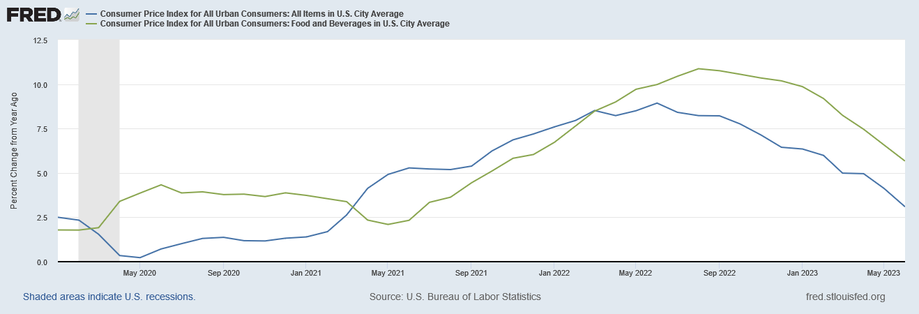
To illustrate, let us consider how we would calculate real disposable incomes using headline CPI, and the CPI index for Food and Beverages in a typical US city. As we can see when we examine their year on year percentage changes, both have significantly different shifts over time.
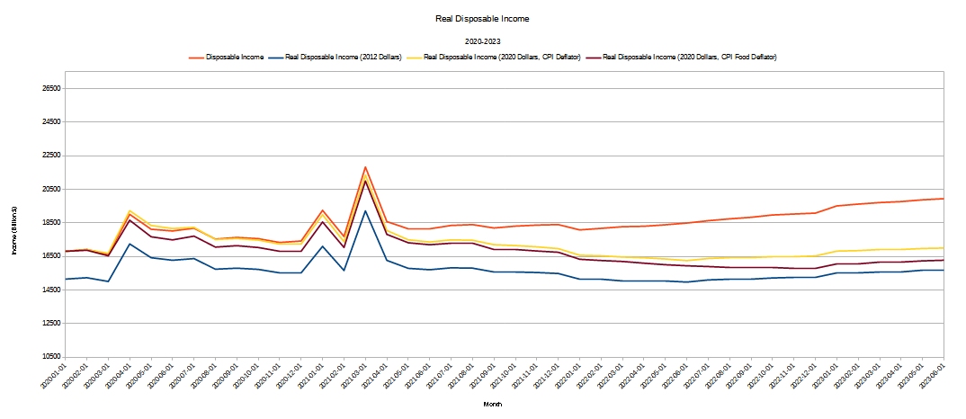
Using both indices to calculate the delfation factor to use for determining real disposable incomes quickly shows how the “real” values can differ not just from the nominal values but from each other.
Setting aside the question of which deflator is the “best” one, what can the differences between the real income graphs tell us?
One point that is immediately illuminated is the degree to which consumer price inflation has impacted real incomes since the Pandemic Panic Recession. As inflation heated up in 2021, real incomes calculated with the CPI-based deflators deviated more and more from nominal incomes and began to approach the structurally smaller real income graph expressed in 2012 dollars. That’s how big a bite inflation has taken out of people’s paychecks over the past few years.
These calculations also underscore how big an impact food price inflation has had on real incomes. As bad as headline inflation has been on people’s wallets, food price inflation has been demonstrably worse, and continues to be demonstrably worse. Even if food prices stabilize from this point forward prior inflation has still taken a permanent bite out of people’s real incomes, and until food prices come down—until there is actual food price deflation—it is not giving it back.
We can also use deflator calculations to assess the geographic impact of inflation as well. Prices do not rise the same everywhere in the US, nor are incomes the same everywhere in the US.
If we look at the average weekly earnings since 2007 for three different states—Texas, New York, and Illinois—we can see there is significant variation even just in nominal incomes for the three states.
Moreover, when we look at “core” consumer price index for Metropolitan Statistical Areas (MSAs) in all three states, we can see prices also vary significantly from state to state.
Note on analytical technique: this data is expressed quarterly to account for variances in MSA reporting, as not all MSAs provide full data in every period.
If we calculate real weekly earnings in terms of 2007 dollars using the individual MSA core CPI metric, we can begin to assess the regional impact of inflation on weekly paychecks.
Tracking from 2007, New York and Illinois saw the greatest increase in real weekly earnings, while the Dallas-Fort Worth area saw a much more modest earnings increase. Houston has seen real earnings drop since 2007.
Yet if we zero in on just from 2020 onward, the earnings growth picture shifts somewhat.
Even expressed in 2007 dollars, New York and Illinois have seen real weekly earnings diminish since 2020, as has Dallas, although just barely. Houston has actually gone from earnings trending down to earnings trending up.
The picture shifts again if we shift the base period for the deflator to 2020.
Now it’s New York and Houston that are showing earnings gains—with Houston showing the most pronounced earnings gain—and Illinois and Dallas showing earnings declines.
What does this show us about inflation? For one thing, it highlights that inflation has been more severe in Illinois than in Texas, with New York somewhere in between.
It also shows us that Houston is doing better than even its sister Texan city Dallas in terms of earnings growth, especially recently.
It shows us that New York and Illinois have experienced significant real earnings decline since the summer of 2021. As bad as inflation has been in the US, it has been the worst in states such as New York and Illinois, and comparatively milder in Texas.
Which one of these graphs is the most “accurate”? Ultimately, that answer depends on where you are. If you live in the Northeast you are probably best able to relate to the real income and earnings calculation for New York, including all of inflation’s impact. What these graphs show presumably you are seeing in your wallet.
By the same token, if food expenditures are a large portion of your monthly household budget, seeing how food price inflation has diminished overall incomes very likely reconciles best with your own direct experience of inflation.
Everyone who has ever looked at the BLS’ monthly inflation report and said “there’s no way inflation is just X%”….you’re probably right. In your area, with your purchasing patterns, inflation’s impact is easily higher and sometimes lower than what is reported for the nation as a whole.
We do well to be mindful of these various and shifting contexts when we look any economic data, whether for a state, for the United States, or for the world as a whole. Not only is the rule “your mileage may vary”, it is almost mathematically certain that your mileage will vary.
The cautionary should be, therefore, to never get too focused on a single value or a single variable. There is simply too much innate variation within the data itself for one to ever take any one value or variable and declare it to be objective reality.
Another cautionary to bear in mind is that both the government announcements of economic data as well as the corporate media propagandizing over this data are going to do exactly that. They are going pretend that the individual values and variables are somehow objective reality. To the extent that they know better (or at least should know better), they are going to gaslight people.
Thus it behooves us never to take what either the government or the corporate media—or even the alternative media—at face value. To the extent we can, we do well to interrogate the data for ourselves, ask our own questions, and puzzle out our own answers.
To be clear, I include All Facts Matter in that precaution. While I will never gaslight anyone, I am still human and my analysis of anything might be wide of the mark. One reason I always link to my information sources, why I provide footnotes documenting my research materials, why I archive my media sources, is so that people have the ability to check my work.
The facts, and our ability to use those facts, are what matter. The facts are the reality, not my analysis nor anyone else’s analysis of those facts attempting to explain that reality.
It is no great economic insight to observe that inflation diminishes real incomes and real earnings. Because of these very obvious impacts, inflation hurts any economy, as consumers are spending more but buying less.
Yet in order to grasp some of the magnitude of these effects, we have to go further than just the headline numbers presented by the government experts and parroted by the corporate media. We need to always be mindful to burrow past the headline numbers and go as deep as we can into the data itself. Only through the various comparisons that emerge do we begin to see what the data can objectively tell us about the real state of the real economy.
All trend lines presented have been calculated using the charting tools of LibreOffice Calc v7.4.0.3 (x64).
Ganti, A. “What Real Gross Domestic Product (Real GDP) Is, How to Calculate It, vs. Nominal.” Investopedia, 2023, https://www.investopedia.com/terms/r/realgdp.asp.


