It’s cold and flu season, which means people get….wait for it…colds and the flu.
However, that makes it sound as if people getting colds and the flu are somehow normal occurrences. Let’s call cold and flu season a “tripledemic” of three common infectious respiratory diseases instead. That way we can make the normal occurrence seem novel, different, and, above all, scary. Can’t have decent fear porn if things aren’t scary.
As a public service, CNN is committed to bringing you the latest updated fear porn, so you know which virus to fear today, and which virus you should fear tomorrow.
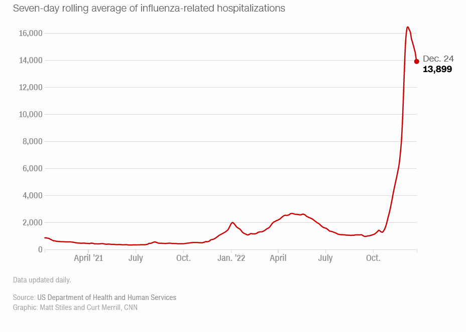
A tough respiratory virus season is underway in the United States, as influenza and the respiratory syncytial virus came early and hit hard this year, straining the nation’s health care system and driving up hospitalizations to rates not seen in years — even as Covid-19 continues spreading across the country.
While this historic season progresses, CNN will be tracking the impact as updated illness figures are released.
Isn’t that nice of CNN?
The first virus CNN wants you to fear is Influenza. Yes, the seasonal source of the sniffles has returned, and CNN means to scare you with it.
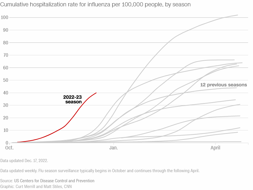
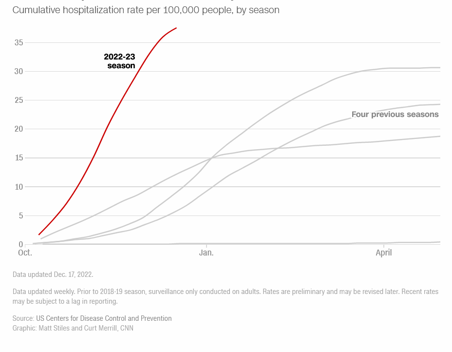
Influenza hospitalizations surged this fall: The cumulative hospitalization rate per 100,000 residents, compiled by the US Centers for Disease Control and Prevention, has eclipsed at least five of the past 12 seasons.
They even give you a nice scary graphic.
See? This year’s graph is red, and a bunch of previous year’s are grey. That makes this year much more scary, right?
And then reality set in.
First, let’s talk a little bit about each year’s graph. The shape of the graph is actually rather important, as it highlights some essential characteristics of influenza-like illnesses.
S-shaped curves such as the one’s in CNN’s chart are known as “sigmoid curves” (because of the shape, which resembles the letter “S”). More precisely, these curves are a particular type of math function known as a logistic function.
A function that models the exponential growth of a population but also considers factors like the carrying capacity of land and so on is called the logistic function. It should be remembered that the logistic function has an inflection point.
Logistic functions model exponential growth scenarios where there is a limit to how large the population can grow, which is why they are appropriate for understanding infectious respiratory diseases—there’s only so many people who can get sick in any community.
Mathematically, logistic functions are expressed as some variation of the following:
Where,
L = the maximum value of the curve
e = the natural logarithm base (or Euler’s number)
x0 = the x-value of the sigmoid’s midpoint
k = steepness of the curve or the logistic growth rate
When applied to disease propagation, the values “x” become a measure of time elapsed since the beginning of disease outbreak (and is represented by the horizontal axis, or “x axis” of the chart). “x0” is the time value for the inflection point—that point at which the rates of propagation begin to slow as the pathogen runs out of hosts to infect.
This inflection point is where the curve gets its signature “S” shape. Where x < x0, the curve is bending up. Where x>x0, the curve starts to bend down, and eventually becomes flat as the maximum population of potentially infected hosts is reached.
The importance of this quick maths excursion is to explain the relevance of the emerging “S” shape of the 2023 graph on CNN’s chart. The curve is already showing signs that it has passed the inflection point, meaning the maximum population of potentially infected hosts is about to be reached. In any outbreak of infectious respiratory disease, there will always be only a finite number of people who will get sick, after which the outbreak will recede.
We find confirmation of this in the declining rate of influenza activity being reported by the CDC’s Weekly U.S. Influenza Surveillance Report
Seasonal influenza activity remains high but is declining in most areas.
The number of flu hospital admissions reported in the HHS Protect system decreased nationally from the week prior for the second week in a row.
Even CNN’s fear porn acknowledges that flu activity is on the decline, in their chart of influenza hospitalizations.
With the cumulative cases (or hospitalizations) for the 2022-2023 flu season likely having reached the inflection point, the rates of infection and hospitalization will overall continue to decrease, and the logistic curve will flatten out as the infected population reaches its maximum. That’s how the mathematics of infectious respiratory disease works, every time.
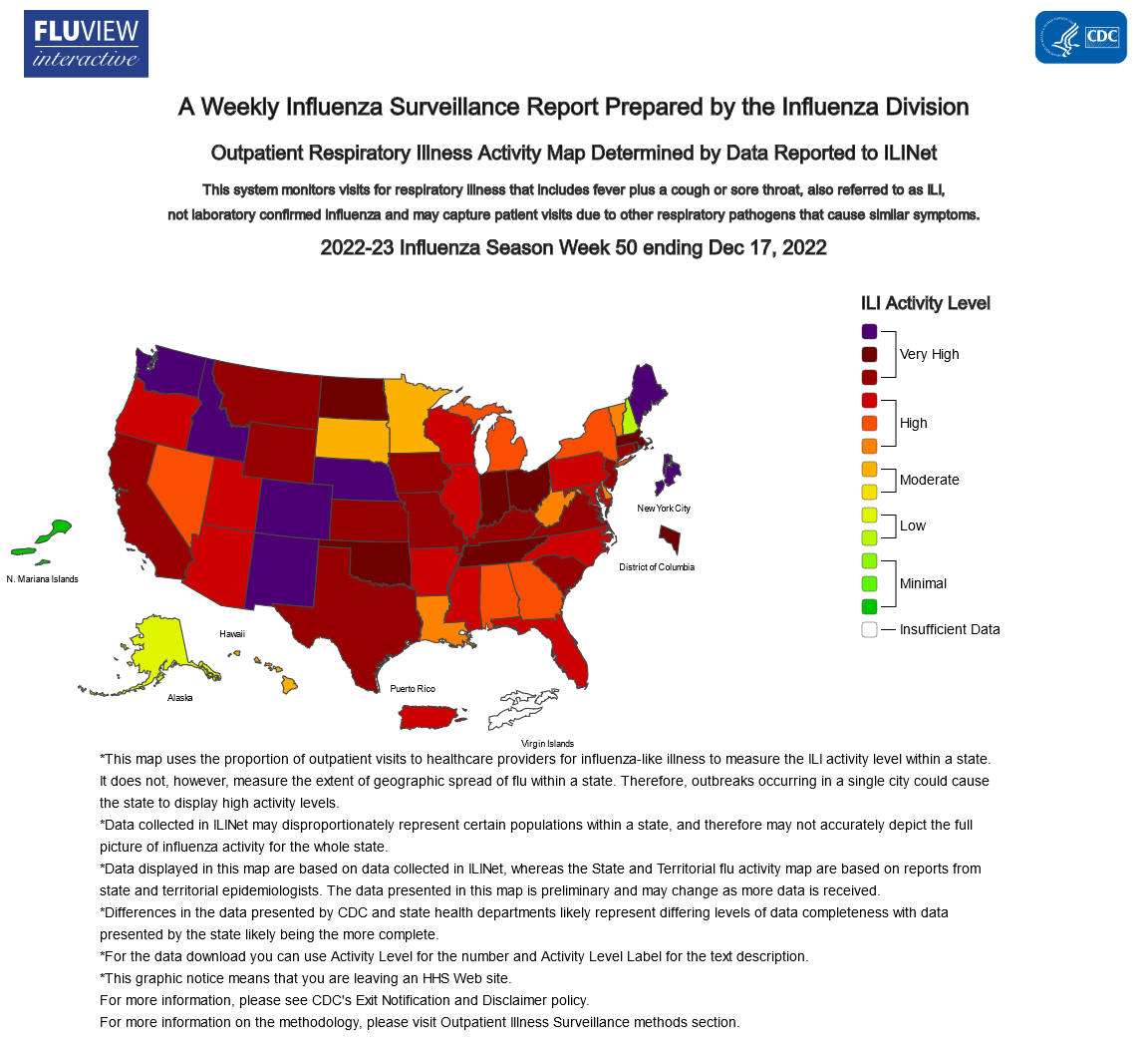
In short, the worst of this season’s influenza outbreak is very likely already over, both in terms of cases and especially hospitalizations. How bad was the “surge” in hospitalizations? Let’s look at a few of the states the CDC identified as having “very high” rates of influenza: New Mexico, Maine, and Washington.
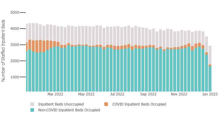
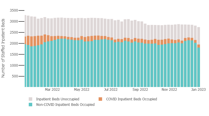
Across the state of New Mexico, this is the hospital utilization reported to the Department of Health and Human Services for 2022:
Note how the occupied hospital beds in New Mexico have been more or less constant since sometime in March. If the number of occupied hospital beds is a constant there could not have been any “surge”. The crisis CNN wants you to fear has simply not happened.
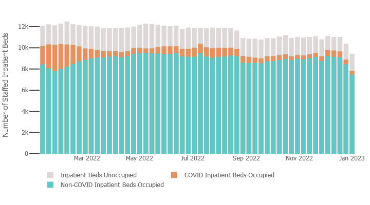
Maine shows a similar lack of a hospitalization surge.
Washington State also shows a marked absence of any “surge”.
This lack of any hospitalization surge will come as no surprise to regular readers, as I debunked that element of the Pandemic Panic Narrative only last week.
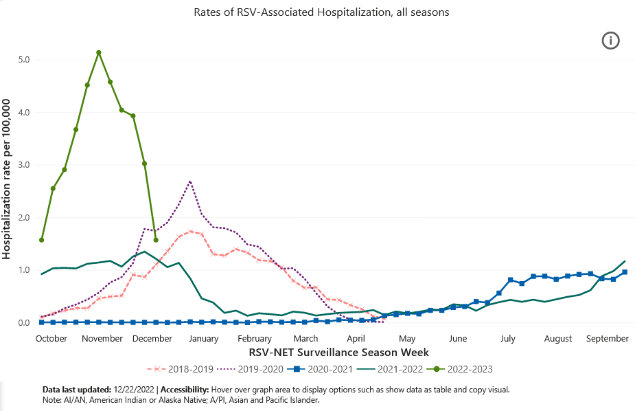
Unsurprisingly, CNN’s chart of RSV infections shows the same logistic function characteristics, including the beginnings of the “S” shape that indicate the inflection point has been reached.
While the number of RSV hospitalizations is undeniably higher this year than last, and significantly so, the rate of RSV hospitalizations has dropped dramatically in recent weeks.
As with seasonal influenza, the worst of the season’s RSV outbreak is arguably already past. Needless to say, as the hospitalization charts above show, RSV did not produce any level of hospitalizations that went beyond what this country’s hospitals could handle. A lot of people may have gotten sick, but not so many as to overwhelm our healthcare infrastructures
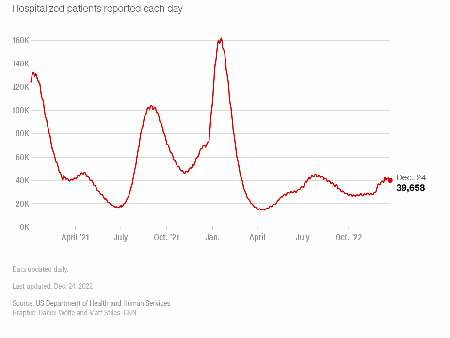
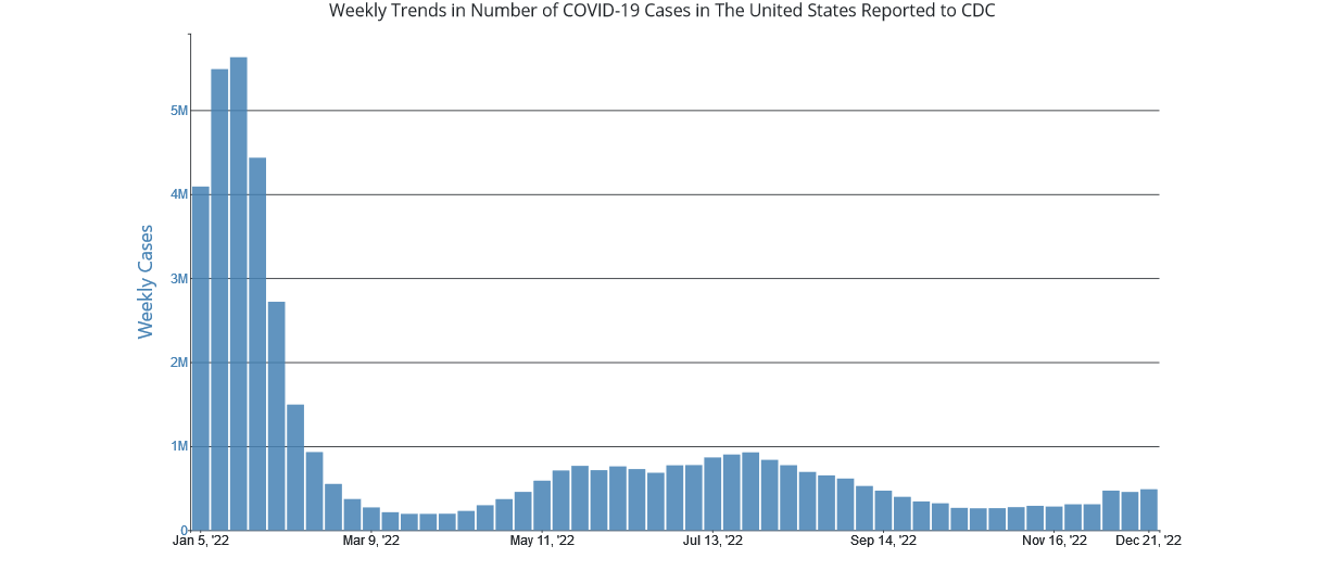
As for their “tracking” of COVID cases, the best they had was a chart of daily cases in the US showing that COVID cases had risen in recent weeks.
Of course, what CNN does not want you to realize is that COVID cases in the US have plateaued the past few weeks.
Calling the COVID outbreak “severe” strains creduility. Nor did it, judging by the hospitalization data, come anywhere close to overwhelming the healthcare system in this country.
When we look at the available data for both diseases such as flu and RSV as well as the utilization of hospital beds, we must remember that it is possible for two things to be true at once. It is possible for the seasonal outbreaks of flu and RSV to be severe—certainly more severe than in recent years—while neither flu nor RSV to have produced enough hospital patients to overwhelm hospitals in this country. According to the data, both of these things are true.
This is the difference between a “concern” and a “crisis”.
Seasonal flu got off to an early start this year, and both cases and hospitalizations related to seasonal flu have risen much faster this year than in recent years. That makes this year’s flu season a concern for anybody.
Yet the healthcare system is not in danger of collapsing under the strain of either influenza or RSV patients—certainly not yet, and with rates of infection on the decline, not any time soon either. Unless and until there is a new wave of infections of either influenza or RSV (or any of the other viruses associated with seasonal flu), this year’s flu season will not become a crisis.
That is the reality of this year’s seasonal flu data: The healthcare crisis CNN wants you to fear has not happened, and there is no data to suggest that it is about to happen. There is no data to suggest it will happen at all this flu season.
However “brutal” one chooses to assess this year’s seasonal flu, the healthcare crisis CNN wants to scare you into thinking is onging simply does not exist—not yet, and likely not ever.





Every year they crank up the fear porn during flu season for as far as I can remember. The difference is in past years we generally ignored it or didn't face the prospect of mandates.
Nice to see the US pulling the same “shifty” as NSW by what looks to be an extension of the surveillance period for 2021 & 2022.
Figure 14 in report below, note similarity to one of your charts:
https://www.health.nsw.gov.au/Infectious/covid-19/Documents/weekly-covid-overview-20221217.pdf