The Economy Created How Many Jobs?
Yes, The Numbers Are Massaged. The Trends Not So Much.
The important context to remember when reading the December Employment Situation Summary from the Bureau of Labor Statistics is always Mark Twain’s famous aphorism “there are lies, damned lies, and statistics.”
As is always the case whenever the report prints a surprisingly good jobs number, we must pause to consider whether that number is a lie or a damned lie, given that we know it is a statistic—and the December report printed a surprisingly good jobs number.
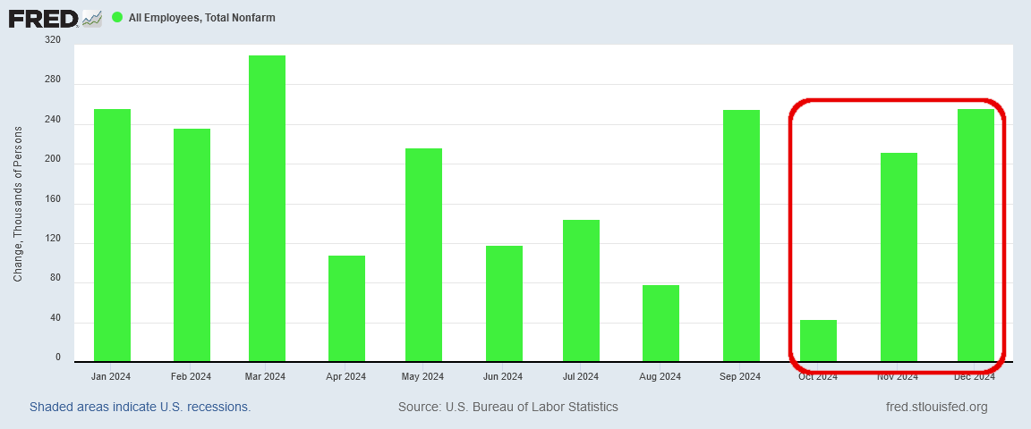
Total nonfarm payroll employment increased by 256,000 in December, and the unemployment rate changed little at 4.1 percent, the U.S. Bureau of Labor Statistics reported today. Employment trended up in health care, government, and social assistance. Retail trade added jobs in December, following a job loss in November.
To put this number in a proper perspective, we need to keep in mind that this is a seasonally adjusted figure. By definition, this number has been massaged at least somewhat.
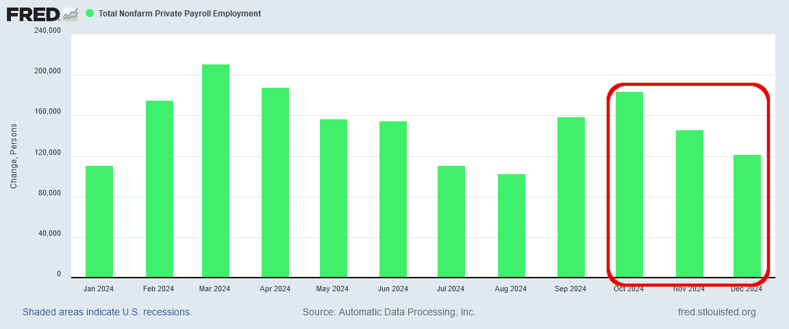
We have reason to immediately question the BLS jobs number, because ADP, which releases its monthly National Employment Report in close conjunction with the BLS jobs report, printed less than half the BLS jobs number. According to ADP, the US economy only created 122,000 jobs in December.
Has the data been massaged? Yes. Seasonal adjustments are by definition massaging the data.
Has it been massaged too much? Let’s see what the data can tell us.
Different Yardsticks Should Not Yield Different Data
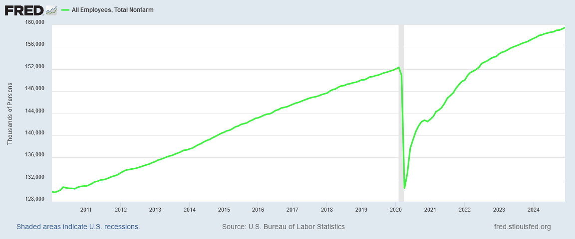
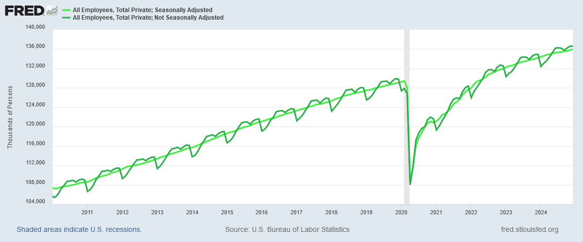
If we look at a longer-term chart, the BLS data does not look to be much out of sorts, if at all. The long term trend certainly looks to be stable and predictable, which ought to lend a measure of confidence to the data.
It would be quite nice if we could put full confidence in the BLS jobs number, because not only does the long-term trend appear to be stable in this country, the month-on-month trend in recent months has been up, according to the BLS data.
From October through November and then December, the number of jobs created each month has steadily risen. At any level of overall employment, that is very good news.
However, this is where we run into the first variance between the ADP and the BLS jobs reports. Over that same three months, from October through December of 2024, the trend in the number of jobs created is negative, not positive.
Instead of employment growth picking up steam, which the BLS report indicates has been the case over the past three months, the ADP report show employent growth losing steam.
Remember, both the ADP report and the BLS report measure the employment metrics of the same overall American population. While each report is generated independently, as they are presumably measuring the same thing we should expect them to be fairly close to one another.
That they are not suggests there is something amiss either with the BLS report, the ADP report or even both reports. Errors of poor measurement are not going to be exclusive to one report or another.
Technique Matters
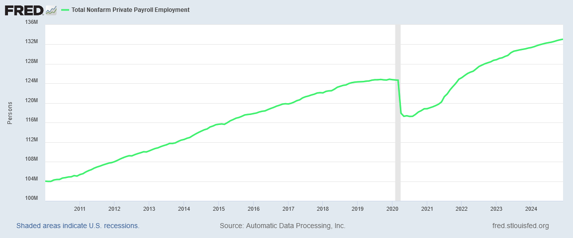
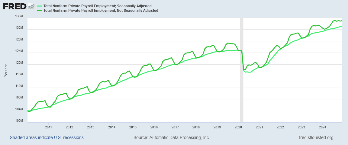
One obvious source of variation between the reports is the seasonal adjustment calculation which gets applied to both reports. At first glance, the ADP report does not appear to print that much differently from the BLS report over the longer-term.
We begin to see how the reports differ when we look at the seasonally adjusted ADP data and the unadjusted ADP data simultaneously.
Straight away we can see that the employment data has a clear seasonal fluctuation. The highly regular “wave” in the data is exactly what a seasonal fluctuation is—a pattern of change within the data that repeats on a set cycle, in this case every twelve months.
This comparison also shows something significant about how ADP performs its seasonal variance calculation: ADP matches the seasonally adjusted data set and the raw data set in March of each year, right before the very obvous increase in seasonal employment. Thus the seasonal chart is a more conservative reading of the data than the unadjusted chart, as the seasonal chart hews to the bottom of the seasonal range in any given year.
By comparison, the BLS seasonal computation hews closer to the top of the seasonal range.
Unlike the ADP report, the BLS does not actually align the seasonal chart with any month during the course of the year, although the two charts tend to come the closest to each other each September. Because in September seasonal employment is demonstrably higher than in January or even March, the BLS seasonal employment chart will always print higher than the ADP report.
Does this make the ADP report more reliable than the BLS report? Not really.
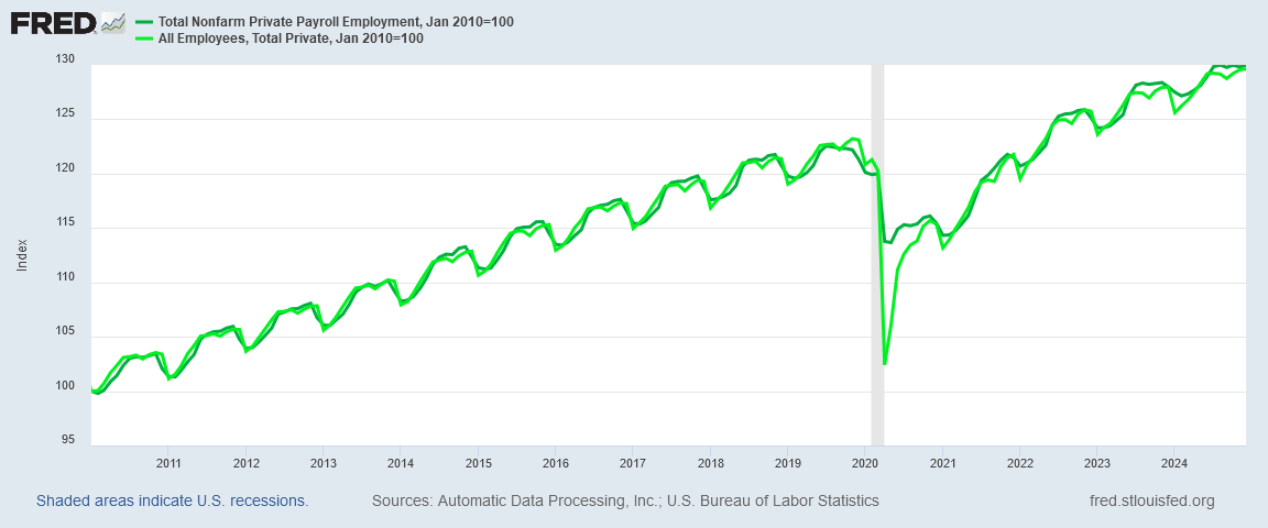
The ADP report is going to be the more conservative employment picture, but that does not automatically make the ADP report more credible. Overall, the two reports do broadly show the same overall trends and relative magnitudes of employment growth, as we can see by indexing the unadjusted data for both reports.
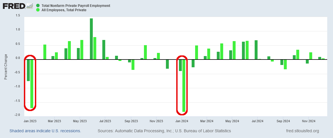
The advantage of the ADP methodology is that it has had smaller January corrections than the BLS report at least for the past two years. As a more conservative view of the employment situation, any tendency it might have to understate job growth is matched by a similar tendency to understate job loss—i.e., “negative” job growth—which is what the annual January corrections invariably appear to be.
Perhaps the best reason of all to question the 256,000 jobs created in December per the BLS Employment Situation Summary is the reality that in the January data there will be a substantial decline in the number of employees counted and/or estimated in the report. It is all but certain the 256,000 jobs notionally created in December are going to be reversed in January.
What Is The Trend?
What we should realize from these statistical artifacts in both the ADP and the BLS jobs reports is that any month’s change in employment, particularly in the seasonally adjusted data, is not a reliable absolute measure of employment. We should not place a high degree of confidence in either the 122,000 jobs figure from the ADP report or the 256,000 figure from the BLS report.
What we can glean from both reports with confidence, however, are the prevailing employment trends. We cannot know with certainty if the number of jobs created in December was 122,000 or 256,000, but we can have confidence in the overall employment trends which appear in each report.
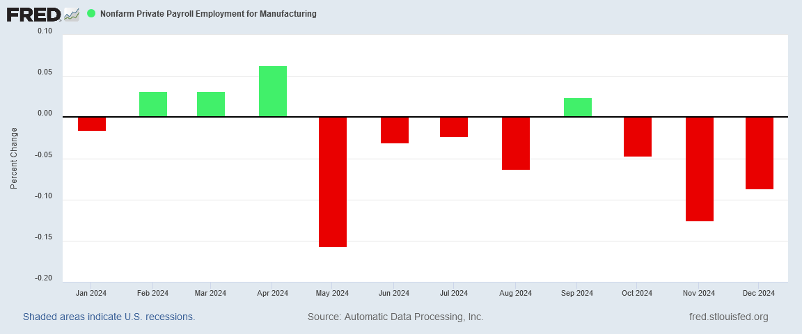
If we look at the seasonally adjusted month-on-month change in manufacturing jobs for 2024 in the ADP report, for example, we see that ADP reports manufacturing job loss in most months.
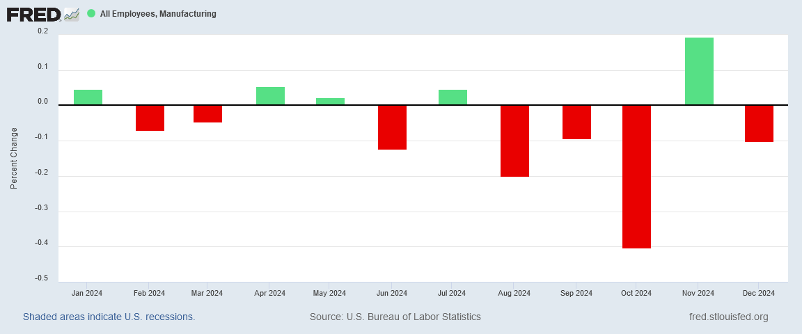
While the months of job loss do not align perfectly with the BLS Employment Situation Summary, the seasonally adjusted BLS report also shows the prevailing trend for manufacturing jobs in 2024 to be one of job loss.
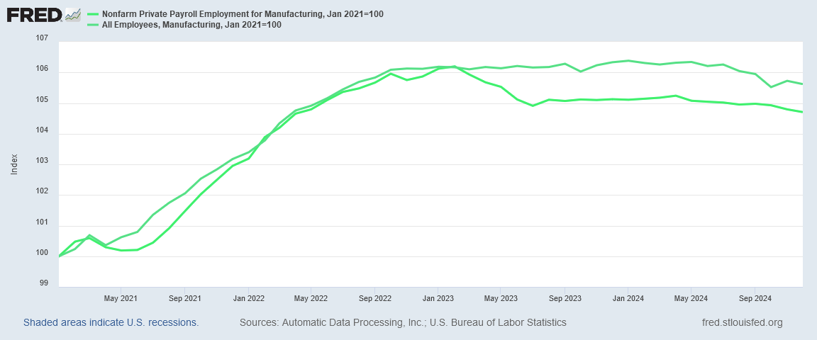
When we index the seasonally adjusted ADP and BLS manufacturing job charts to January of 2021, we see that initially at least, they chart the same general employment growth.
Where the two reports diverge is in the first half of 2023. According to the ADP data, that was a period of pronounced job loss in manufacturing. The BLS data does not show that same loss.
However, both reports show the same phenomenon that I have noted before in manufacturing—that manufacturing job growth largely ended in the fall of 2022. With or without the dramatic job loss in the spring of 2023, we can have very strong confidence in the lack of job growth in manufacturing from October 2022 onward.
It is also worth noting that, from mid-2023 onward, both the ADP and BLS manufacturing job prints show the same plateau and then incremental decline—yet another confirmation of the stagnation and then decline in manufacturing jobs which I have discussed repeatedly in recent months.
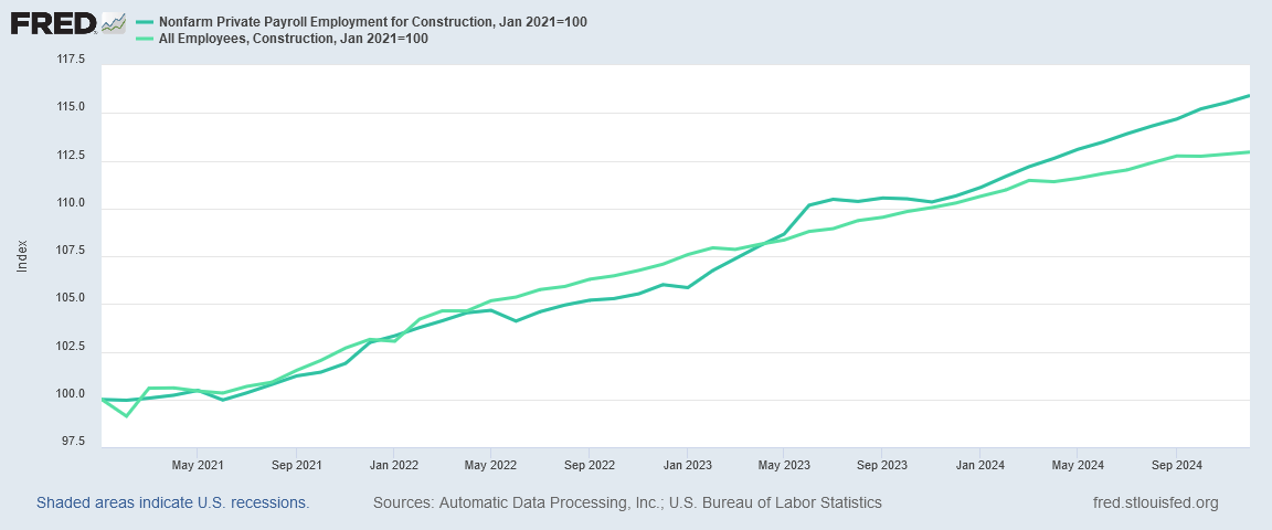
As we look at the different employment sectors, we see the same broad correlations between the two reports, although there is a pronounced break at certain junctures for some sectors.
In construction, for example, job growth per the BLS report slowed significantly in early 2024.
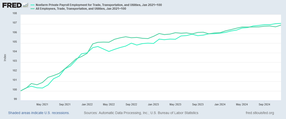
In Trade, Transportation, and Utilities, on the other hand, the overall job growth trends are virtually identical, particularly from 2023 through 2024.
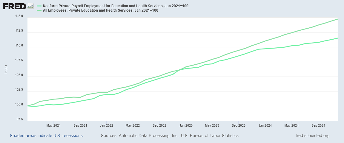
In Private Education and Health Services, however, it is the ADP report that shows the job growth slowdown, beginning in late 2023.
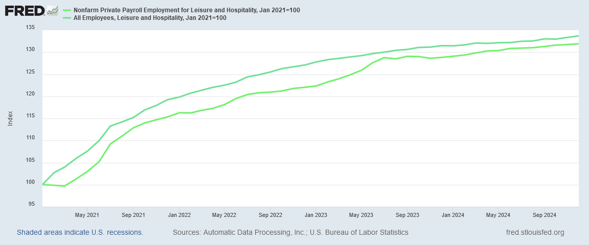
Leisure and Hospitality, on the other hand, have for the past eighteen months shown largely similar trends—and the trend in both reports indicates hiring in this sector has tapered dramatically from what it was in 2021 and 2022.
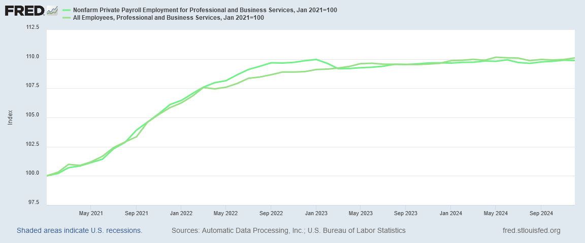
In the Professional and Business Services sector, there are no significant variances between the two reports. However, both reports indicate that job growth in this sector has been virtually nil since early 2023.
Job Numbers Not Great
If there is one broad takeway from the individual employment sector charts, it is that job growth in this country is not that great. With multiple sectors showing slowing job growth and even no job growth, the realistic assessment of the employment situation in this country is not altogether good. While it is reasonable to assess that there is some job growth that occurred in December, the weakness in the sector-level prints suggests that the ADP job growth figure of 122,000 is the more credible figure.
That the BLS data has been called into question repeatedly by the Philadelphia Federal Reserve tilts confidence even more towards the ADP report’s figures.
Even within the broader Employment Situation Summary itself there are reasons to question the BLS’ 256,000 jobs figure.
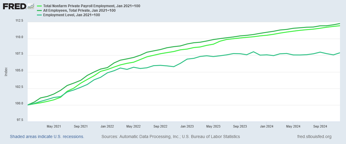
While the ADP report does largely align with the Establishment Survey’s All Employees data within the Employment Situation Summary, neither report aligns well with the Household Survey’s Employment Level data.
Beginning in 2022, the Household survey has been printing minimal job growth and even overall job loss. Again, it is important to note that this aligns with calculations maintained by the Philadelphia Federal Reserve, which has ascertained extremely low job growth statistics in multiple quarters since 2022.
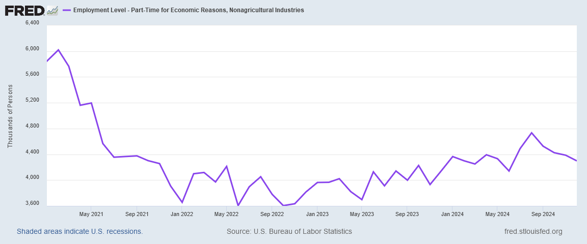
A further indication of job weakness in this country is the gradual rise of part time work since late 2022.
It is intuitively obvious that full-time jobs are preferable to part-time jobs. An economy that produces an increasing number of part-time jobs while seeing stagnant and even declining overall employment is not an economy that is strong or that has robust job markets.
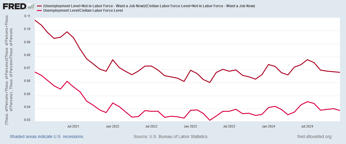
The incremental rise in unemployment is another indicator that the jobs markets in the US are somewhat less than robust.
One thing we should pause to note about the reported unemployment numbers: they are undoubtedly more optimistic than they should be, as the “real” unemployment level is somewhat higher.
One quirk of the way the BLS tracks employment is that people who do not have a job and who are not actively looking for work are technically not in the labor force, and therefore are not technically unemployed, but are instead listed as “Not in the Labor Force.”
However, at least a subset of the people listed as “Not in the Labor Force” would like to have a job now. If we add that number to the number of people listed as unemployed, and then divided the resulting figure by the sum of those listed as being in the Labor Force plus those Not in the Labor Force but who want a job now, we get an unemployment rate that is significantly higher than the official unemployment rate.
Regardless of which way one calculates the unemployment rate, however, the reality is still that unemployment is rising in this country—which means, of course, that joblessness is increasing.
Is the BLS guilty of looking at the employment situation through rose-colored glasses?
I would say that they are. Whether their modeling is simply out of step with the realities of today’s job markets or whether they are simply wedded to an optimistic view of seasonality, there are numerous indicators that the Employment Situation Summary has developed a pronounced tendency to overestimate the overall employment situation. In any given month its jobs figures will tend to be higher and more optimistic than the ADP National Employment Report, which appears to be a structurally more conservative assessment.
We can certainly say that the social media victory laps Joe Biden’s handlers enjoy tweeting each month are not at all warranted!
Reconciling the ADP and BLS job reports also points out the extent to which corporate media is simply not at all inquisitive about the jobs data. Instead of scrutinizing the data and assessing its credibility and its probable accuracy, corporate media has become complacent. There is little or no curiosity about the variances between the two reports, and absolutely no enthusiasm for analyzing them.
Consequently, corporate media routinely overstates the employment situation in the United States. They are blissfully unaware that the US is bogged down in a long and deepening jobs recession, and that the employment outlook in this country is becoming more and more uncertain.
Even worse, corporate media is ignoring the extended decline in manufacturing employment in this country. That jobs overall are increasing does not alter the economic harm that occurs when an entire sector of the economy is allowed to simply wither and die, yet corporate media does not bother to explore that dimension of the jobs data.
Is the BLS jobs data massaged? Yes—it has to be, if only to address the effects of seasonal fluctuations in labor. Yet the true significance in the jobs data—whether obtained from the BLS Employment Situation Summary or the ADP National Employment Report—lies in the trends that data reveals. While any individual month’s numbers are to a degree problematic, it is in the trends charted by those numbers that we are able to see if the employment situation in this country is getting better or worse.
The jobs data is massaged. The trends not so much.
When we look at those trends, it is clear that the employment situation in this country is definitely getting worse.
It is equally clear that corporate media has no interest in reporting on that, and would rather promote a false narrative of job growth sustained only by looking solely at the top level numbers and ignoring everything else.


Excellent interpretation of a propaganda report.
I prefer the labor participation rate numbers. Ain’t pretty.
https://www.bls.gov/charts/employment-situation/civilian-labor-force-participation-rate.htm
The Labor Force Participation Rate (LFPR) is a statistic calculated by the U.S. government, specifically through the Bureau of Labor Statistics (BLS), which measures the proportion of the civilian non-institutional population that is either employed or actively seeking employment. Here's how it is defined and calculated:
Civilian Non-institutional Population: This includes all people in the civilian population, aged 16 and over, excluding those in institutions like prisons, long-term care facilities, or the military.
Labor Force: This encompasses all individuals who are either employed or unemployed but actively seeking work.
Employed: People who did any work for pay or profit during the survey reference week, including part-time workers.
Unemployed: People who did not have a job, were available for work, and had made specific efforts to find employment within the past four weeks.
Formula:
\text{Labor Force Participation Rate} = \left( \frac{\text{Labor Force}}{\text{Civilian Non-institutional Population}} \right) \times 100
Key Points:
The LFPR does not differentiate between full-time and part-time workers; all are counted as employed if they meet the criteria.
People who are not looking for work (e.g., retirees, students, those not interested in working) are not counted in the labor force, thus not affecting the participation rate.
The rate gives insight into how engaged the population is in the labor market, which can be influenced by demographic trends (like aging population), economic conditions, social policy changes, or shifts in societal norms regarding work.
Significance:
It's a critical indicator of the health of the economy and labor market dynamics. A declining LFPR might indicate more people are leaving the workforce, possibly due to retirement, discouragement from job searching, or other reasons. Conversely, an increase might suggest more people are entering or re-entering the job market.
The U.S. government collects this data through surveys like the Current Population Survey (CPS), providing monthly updates on this statistic. It helps policymakers, economists, and the public understand labor market participation trends, which in turn can influence economic policy, social programs, and workforce development strategies.