Bidenomics Is Working? For Whom?
The BLS Data Offers An Answer, And It's Not A Good Answer
Bidenomics is working. We’ve heard that from the (Biden-)Harris Administration more than once over the past few years. But for whom has it been working?
That question goes from being merely political to dangerously controversal and even disturbing when we examine it against a backdrop of immigration—which is another of the many contentious issues this election cycle.
Calling immigration a politically sensitive issue is the epitome of understatement. It is without a doubt the most contentious and divisive issue surrounding this year’s electoral politics.
Perhaps no aspect of immigration is more politically sensitive than where immigration impinges upon employment. Immigration by its very nature affects the size of the overall labor force, and on that basis alone plays a role in setting demand for labor, which in turn plays a role in whether overall wages trend up or down.
That much is basic economics.
It is quite remarkable, therefore, when we see social media commentators venturing into the murky waters of the immigration debate who are not known for so doing. When that happens, we should immediately begin questioning what the data shows, and what conclusions we may plausibly draw from the data.
These are things we must do any time we confront the assertion that “Bidenomics is working”.
First, let’s establish some basic context. What occasions this exploration is an observation made by Rich Tehrani, media executive and investment banker, on LinkedIn, to the effect that migrant workers accounted for all new employment in the United States in recent years.
Tehrani comments frequently on IT issues, and only rarely strays outside of that lane. That he should be the one making such a posting is itself remarkable.
But even more remarkable is the graphic which is the foundation for his assertion. Readers of this Substack will no doubt immediately recognize the characteristics of the FRED system, as I routinely use their charting tools both to perform much of the analytics that go into my articles and to generate the graphics to help explicate my conclusions. Rich Tehrani is using official government data, maintained and published by the Bureau of Labor Statistics.
Whatever challenges one might be tempted to make regarding his assertion, the one assertion that cannot be made is that he is using questionable data. While the BLS data has been getting progressively less reliable and more sketchy in recent years, it is still the “official” data on employment in the United States, and, as such, is the data most would consider “authoritative.”
The graphic would appear to show a clear employment growth trend between foreign-born and native-born workers that gives foreign-born workers a decided advantage. If that trend is indeed taking place, at a minimum one can envision a variety of labor consituencies objecting to that trend being an expression of government policy—which it would arguably be since this is the “government” data.
In the same time frame, a similar statement is also floating around on X.
Thus we have before us a rather pertinent question: What in the Nine Rings of Hell is going on with employment in this country?
Someone certainly has some explaining to do. Since no one from DC Swampland is likely to come forward with that explanation, let’s interrogate this data further and see if we can tease out the dynamics at play here.
First, a bit of explanation of Tehrani’s original graphic. He pulled from the same FRED system I use regularly, querying BLS data sets on employment. A live version of that same graph is available here.
What Tehrani did was index the employment data for both foreign-born and native-born workers to January of 2007., The graph shows how both sets of workers have grown relative to their January 2007 levels.
In order to assess the data properly, let’s set some context by noting that the native-born employment level is considerably greater than the foreign born employment level.
Straight away one thing we must recognize about the indexed values is that they are relative to very differently sized base amounts. Fifty thousand new foreign born workers is a much larger percentage of the base foreign born worker level than it is of the native born worker level.
If we place the foreign born workers on a secondary axes and then overlay the differently-scaled data, the result is a perhaps less dire outlook.
So all is well with employment of native-born American workers?
Not exactly.
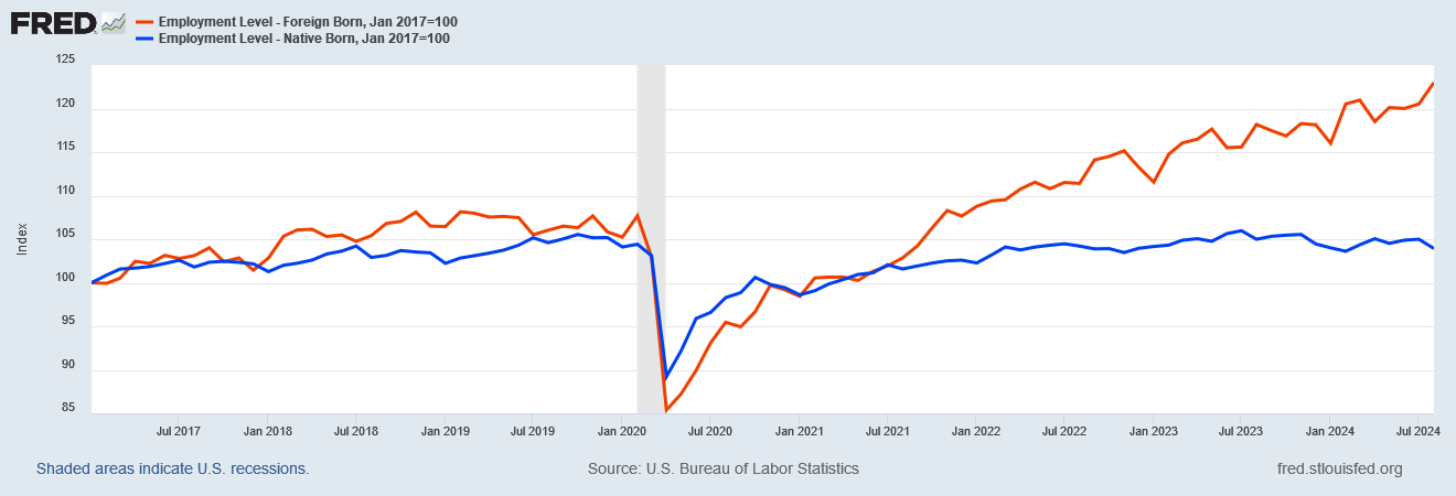
For the remainder of this analysis, I will set the index base to January 2017. As this sets the base to the beginning of Donald Trump’s first term, the resulting index comparison lets us look at the data pertinent to both Donald Trump’s first term and the ongoing (Biden-)Harris Administration. Indexed, the foreign-born chart shows a much steeper slope during the (Biden-)Harris Administration than the native born chart.
At a minimum, we have a labor dynamic where foreign born workers are being hired at a faster pace than native born workers. All things being equal, that reality is at the very least counterintuitive.
But, comes the question, are all things equal?
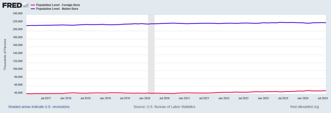
Let’s first look at the population level since January of 2017, to properly apprehend the actual demographic dynamics in play. As with employment, the native born cohort is vastly larger than the foreign born cohort.
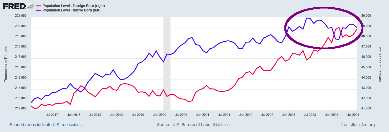
If we put the foreign born workers on the right axis and overlay the two data sets, one thing that becomes immediately apparent is that there has been a noticeable decrease in the native born population since last summer.
There are currently 925,000 fewer native born persons in the United States than there were in June 2023.
That’s the first problem we should be concerned with—a significant decrease in the native population of the country.
There is another trend we should identify as well: the ratio of foreign born individuals to native born individuals within the population is rising and has been since at least the Obama Administration.
We should note, however, that beginning around October 2020, and certainly during the (Biden-)Harris Administration, the rate at which that ratio has been increasing is significantly higher. This is a clear demographic shift taking place.
If we focus on the Civilian Labor Force, we see the same increase in ratio of foreign born to native born individuals.
That the ratio behaves the same as for the overall population level is unsurprising.
This also means that we have an increase within the labor force of foreign born workers beginning in the fall of 2020 and continuing through to the present.
If we index the foreign born and native born labor force components to January 2017, we see relative growth rates similar to what Tehrani identified in his original graph.
From this we can safely presume that the dynamics Tehrani identified are a reflection of a dynamic playing out in the overall US population.
However, there is a wrinkle: this dynamic does not appear in the unemployment data.
These demographic shifts of rising foreign born cohorts disappear completely when we consider the unemployment data.
Even if we look at the raw unemployment levels, and overlay foreign born and native born unemployment, we see similar trends and trend rates.
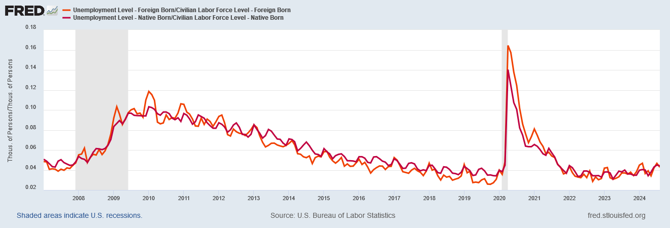
Even if we look at the unemployment rate, dividing the unemployed level by the civilian labor force level for both foreign and native born workers, we see almost the exact same rates for both.
This is unexpected. If we are seeing rising immigrant employment relative to native employment, if the overall employment dynamics are the same for both demographic cohorts, we should see immigrant unemployment show a similar increase relative to native born unemployment.
Clearly, the employment dynamics for foreign born and native born workers are not the same. All things are demonstrably not equal.
When we look at the employment level relative to the overall population for both foreign-born and native born demographic cohorts, what we see is that the employment ratio for foreign-born workers has risen relative to the employment ratio for native-born workers.
If we zoom in on the employment ratio since 2017, we see that, since last year, the ratio for native-born workers has actually decreased even while the foreign born ratio continues to rise.
While we should be cautious about concluding why this is happening, the data clearly shows labor dynamics in this country are more favorable to foreign born workers than native born workers.
For the identitarians within the Democratic Party, this could be particularly problematic for the impact it has on employment ratios among ethnic groups. As it turns out, Asians and Hispanics show employment population ratios which approximate that of foreign-born workers, while Blacks and Whites show employment population ratios more similar to that of native-born workers.
However, when we examine employment ratios broken down along other dimensions, we see some further troubling trends that warrant closer attention.
When we differentiate by education level, for example, we see that employment ratios peaked last year and have been declining since for all education levels.
When we differentiate by disability status, we see that employment ratios for persons with a disability has increased post-COVID, and has only posted a significant decline in recent months, while for persons without a disability the employment ratio has been trending down since last year.
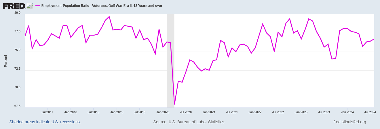
Employment ratios for veterans has been significantly more volatile post-COVID, and has been declining since late last year.
Nor is that trend uniform among veterans from different service periods.
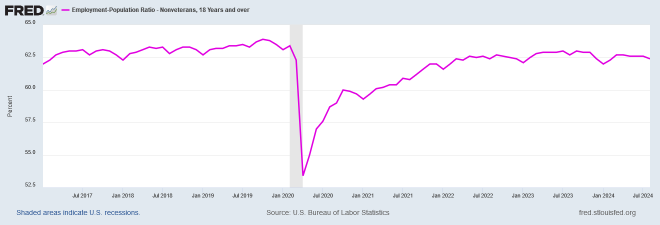
The employment ratio for non-veterans, however, has been significantly less volatile, although it has also been declining since last year.
Keep in mind these are employment ratios. These are the percentages of each demographic slice who have a job. These are measurements of how positive—or negative—labor dynamics have been for each of these separate demographic slices.
Why is employment for non-veterans more stable than it is for veterans?
Why did employment for the more highly educated begin declining early last year and only later in the year for the less highly educated?
Why has employment risen for people with a disability? Why has employment for people without a disability declined over the past year?
The BLS data does not answer these questions, and so I will not attempt to impute an answer to the data. The BLS data, however, does make plain these are questions which do need to be asked and which do need a broad and public airing.
These may be uncomfortable questions for some—this certainly has been an uncomfortable article to write—but the imperative for the interrogation is not made less by that discomfort. If anything, it is made greater.
Labor dynamics have unquestionably changed post-COVID. However, they have changed differently for different demographic cohorts, and that change in more than a few instances not been a good one.
I have been saying for quite some time that the labor force has been “toxic” rather than “tight”.
When we look at employment breakdowns along different demographic lines, we see undeniable confirmation of this.
“Something” has gone awry with employment in the United States. For all the (Biden-)Harris Administration’s crowing about non-existent jobs it has created, and for all the posturing by the Federal Reserve about labor markets “finally” softening enough (meaning enough workers are now without jobs, which has been their goal all along) to allow the federal funds rate (which only sets interest rates for workers, not businesses and certainly not Big Business) to come down, there are definable portions of the American population for whom employment has not been improving in recent years.
These are shifts that happened after the COVID Pandemic Panic Recession, and while some of them began at the very end of the Trump Administration, at a minimum the (Biden-)Harris Administration has done exactly nothing to mitigate or alter these shifts. The (Biden-)Harris Administration has not even acknowledged these shifts.
What Kamala Harris has done repeatedly is cackle that “Bidenomics is working”.
“Bidenomics is working”? For whom?
For large and definable sections of the American population, “Bidenomics”—now “Kamalanomics”—has been demonstrably not working.
For large and definable sections of the American population, “Bidenomics”—now “Kamalanomics”—has either done squat to improve the economic situation or has made it palpably worse.
Kamala Harris’ heavy hand of government regulation has not been kind to the American worker these past three years. It beggars belief that it would be any kinder should it be given another four years of free reign over the American economy.








Bidenomics is working to destroy America.
Bidenomics works for everyone named Biden: Jill gets to live in a really nice house, Joe gets $27 million from China, Hunter got thousands of dollars from Burisma.