Last year at this time I wrote up an analysis of inflation and income assessing how inflation had impacted incomes during the Biden-Harris Administration to date.
With the Presidential election now in full swing, now is a good time to revisit that analysis, and compare the Trump Administration’s income and inflation data vs the Biden-Harris Administration’s income and inflation data.
I will begin with an important reminder about inflation metrics themselves: your mileage will vary. All inflation indices are going to result in somewhat different measurements of price increase and decrease. Some, like John William’s ShadowStats series, produce significantly different inflation values.
However, where inflation indices broadly agree is in the trends for price increases and decreases, even though the absolute index values themselves can vary greatly. We can see this just by comparing various inflation gauges maintained by the Bureau of Labor Statistics and the Bureau of Economic Analysis.
Even if we set the indices to the same base period we still see notable trend variance the farther out we go along the timeline.
The trend convergence is important, because even ShadowStats shows the same trends as the official BLS and BEA indices.
While we should be cautious about looking at inflation metrics as an absolute measure of price levels at any one point in time, the trend convergence means we are able to reliably use even the official inflation metrics for evaluating inflation trends.
As the official data is freely available to anyone, by using that data set my analyses can be easily replicated by anyone, and thus my work may be scrutinized and challenged. Anyone doubting my analyses is welcome to revisit the data and evaluate where, when, and if I am wrong. If I should ever be wrong, please tell me in the comments section—then we can all learn something!
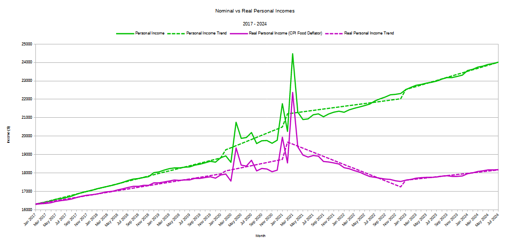
As is readily made plain any time corporate media discusses inflation and incomes, there is a dramatic difference between the nominal income levels and “real” income levels. “Real” income levels attempt to factor out inflation’s influence upon the purchasing power of a dollar today vs a dollar a year ago, or five years ago, or even seven years ago. Thus a comparison chart of nominal vs real incomes always looks like this.
The widening gap between the two income graphs is the impact of inflation.
The BEA, when calculating real income levels (or real GDP levels), uses its own inflation gauge called a “Implicit Price Deflator” However, a deflator is calculated merely by taking the price level in the current period and dividing it by the price level in a pre-determined base period1. We are not therefore limited to the BEA’s Implicit Price Deflator for gauging inflation’s impact, and we can use directly the Consumer Price Index, the PCE Price Index, or any of their corresponding subindices as deflators. We merely need to take the ratio of any index value for any period against a pre-determined based period. If we’re using the Consumer Price Index, for example, the deflator calculation looks like this:
With this formula in hand, we can quickly and easily calculate “real” personal income from the nominal personal income as gathered by the BEA against various inflation indices. For this article I am using the Consumer Price Index, the PCE Price Index, and the food subindex of each, with the data from January of 2017 onward.
Unsurprisingly, the variance we see in the inflation indices yields differing measurements of “real” personal income.
However, what we also see is that, while there is variance for the absolute data points calculated using each index as a deflator, we see the same broad trends for all indices.
With a reliable trend convergence, we can now drill down into the time periods of both the Trump Administration and the Biden-Harris Administration, and see how real incomes have performed during each.
In order to get a clear apples to apples comparison, we now take the data for each administration’s time frame, and index it to the start of that administration. Thus, for the Trump Administration we index the data to January 2017, and for the Biden-Harris Administration we index the data to January 2021. This lets us see the proportion by which incomes have risen or fallen for each, and yields the following charts.
For the Trump Administration, real income performance looks like this.
For the Biden-Harris Administration, real income performance looks like this:
During Donald Trump’s first term of office, real incomes rose between 6.7% and 9.4%, depending in the inflation metric used for the deflator calculation. During the Biden-Harris Administration to date, real incomes have fallen betwee 2.2% and 5%.
Note: to maintain consistency of presentation the vertical axis is to the same scale for both charts, from a low of 85 to a high of 130.
What is perhaps most remarkable about real personal income performance under Donald Trump, however, is that the Pandemic Panic lunacies had overall relatively minor impact. While personal incomes fluctuated significantly suring 2020, the overall trend was only slightly greater than the pre-COVID trend under Donald Trump.
Under Biden-Harris, however, real incomes trended down until January of 2023, and while they are rising again they are not rising at the same pace as before COVID.
These trends we see regardless of the index we use as a deflator. Not only has there been real income loss under the Biden-Harris Administration, but what growth there is currently is sluggish and uncertain relative to the Trump Administration.
We see the same outcomes even when we change the income metric from the BEA’s Personal Income to the Bureau of Labor Statistics Average Weekly Earnings. While Average Weekly Income shows a smaller magnitude of change especially during and right after the Pandemic Panic, the trends are the same.
Indexing for the Trump Administration, we again see rising indexed real weekly earnings throughout Donald Trump’s first term of office:
We again see declining indexed real earnings during the Biden-Harris Administration to date.
If we want to summarize each administration’s real weely earnings growth, the result looks like this.
Trumponimics meant people’s incomes rose. Bidenomics means people’s incomes fell.
One interesting factoid the summary chart shows: Not only did real weekly earnings rise during the Trump Administration and fall during the Biden-Harris Administration, but nominal weekly earnings rose more under Trump than under Biden-Harris. Even in nominal terms, workers did much better under Donald Trump than under Joe Biden.
The summary graph also answers the question of why so many Americans consider the US economy to be in a recession: for the average American worker, the economy is in recession. Shrinking paychecks are a recession for most people.
Amazingly, the “experts” do not understand this. They confine their perspective to the the top-level macroeconomic data and claim the economy is growing.
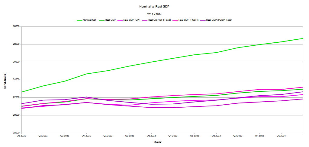
However, the use of inflation indices as deflators also provides some valuable perspective on the BEA’s macro GDP data. Bear in mind the BEA uses its own deflator to calculate its “real” economic data. If we take the inflation indices on a quarterly basis, and use those to calculate real GDP, the economy does not appear to be nearly as robust.
Using the inflation indices as deflator, from Q4 2021 through Q2 2022, we see a deeper and slightly longer contraction than the official “real” GDP data shows.
Why do people act as if the US economy is in recession? Because much of the data, viewed from the consumption perspective of the average American, shows the US economy is in recession. No matter what the “expert” analyses might show at the macro level, inflation—and inflation’s impact on American paychecks—has not been kind to most Americans, and regardless of what the most recent data may show they are still feeling the pinch.
Americans are not being at all irrational when they perceive the US economy to be in recession. From the perspective of the average consumer or the average worker, it is.
Here I will reiterate the observation I made at the beginning: your mileage may vary. Inflation indices as well as the BEA’s Implicit Price Deflator are all calculated with different weights being given to different inputs. By design, they present different perspectives on the raw economic data.
How well any particular index conforms to a person’s own apprehension of the economy as experienced at the grocery checkout line or at the restaurant cash register is always going to be problematic. For some people these indices understate inflation’s impact, while for others these indices overstate inflation’s impact.
We should not apprehend any one inflation index as being a perfectly reliable absolute measure of the underlying raw data. No inflation index is that and no inflation index can ever be that.
We should, rather, look across the range of inflation indices and understand the broad price trends that are being charted. We should understand also that inflation’s impact is felt not just because prices are rising, but because prices are rising relative to paychecks. We should understand that inflation’s impact is also because prices various goods and services are shifting relative to each other.
Inflation hurts consumers because these relative impacts alter the range of buying behaviors which are available to the average consumer. Inflation reduces how much we can buy of the goods we want and need most of all.
When inflation is limiting our purchasing choices, hearing the “experts” crow about the economy “growing” is never going to sound believable. Economic growth in areas that consumers and workers do not experience is, from the perspective of consumers and workers, economic growth that might as well not exist.
Inflation is in the modern economy an unavoidable reality. Like it or not, inflation is always with us.
However, the reality for the Biden-Harris Administration is that the worst inflation in decades happened in the middle of their turn at the economic helm.
The reality for the Biden-Harris Administration is that, because of inflation, the economy has grown less for ordinary workers and consumers—i.e., for voters—than it did under Donald Trump, even with the lunacies of the Pandemic Panic.
The reality for the Biden-Harris Administration is that, because of inflation, worker paychecks have shrunk in real terms, and are even now not coming anywhere near the amount of income growth needed to make up for lost purchasing power.
The reality for the Biden-Harris Administration is that, because of inflation, ordinary workers and consumers—i.e., voters—are demonstrably worse off today than in January 2021.
The reality for the Biden-Harris Administration is that, because of inflation, the economy performed better under Donald Trump—and there is no spin that is ever going to change that.
Ganti, A. “What Real Gross Domestic Product (Real GDP) Is, How to Calculate It, vs. Nominal.” Investopedia, 2024, https://www.investopedia.com/terms/r/realgdp.asp.


A dozen regular eggs (not Cage Free, organic etc) cost me $3.77 at Aldi!! $7 for a dozen eggs and 3 peppers, goodnight!
"Shrinking paychecks are a recession for most people. Amazingly, the “experts” do not understand this. They confine their perspective to the the top-level macroeconomic data and claim the economy is growing."
You are 100% correct about that. Nothing makes me more angry than watching a news program that says we don't have to worry about a recession because consumer spending has been "resilient" and people are spending more than before. Well, duh! They HAVE to spend more than before because everything costs more than it did before. They aren't buying more, they are just spending more for the same (or less) stuff.